Resand
Visual Identity for a Circular Sand Company
Today, metal foundries produce around 70 million tons of waste sand each year. A sand recycling start-up from Finland had the solution, but no one knew about it. Through a complete renewal of their name, brand, tonality and visual identity, they were transformed into a bold, purpose-driven technology brand to better match their mission to end sand waste.

Starting point
The world is running out of sand, with billions of tons of sand being used and wasted each year. Foundries at the moment are only able to recycle a fraction of the sand they use, producing about 70 million tons of waste sand every year. The Finland-based company, formerly FinnRecycling, had the solution and technology to help. They saw the need for a complete identity renewal to get ready for international target markets.
Creative approach
With the company's aspiration to distinguish itself in the B2B metal foundry industry, we recognized the importance of having a confident voice that resonates as a forward-thinking technology company. The brand's tonality and key messages were crafted to reinforce their mission of reducing sand waste. The goal was to establish a visually striking yet clean identity that would transform the brand from a modest recycling startup to a strong voice as a foundry technology brand. Drawing inspiration from their sand recycling machinery and its form language, and the colour and texture of the sand material became central elements in shaping the identity.
Implementation
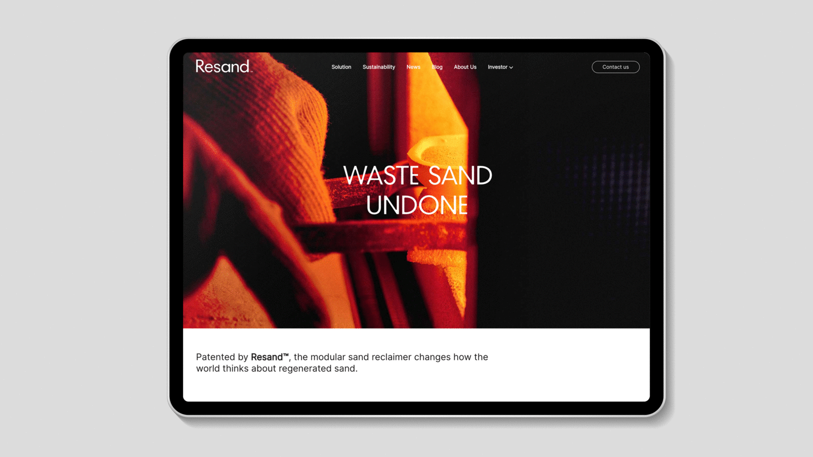
The new name, Resand, was coined to reflect their commitment to sand preservation and recycling. Aligned with the brand's mission to end sand waste, the revamped brand tonality and key messages are designed to resonate with targeted foundries. The logomark draws inspiration from curved metal features within Resand's machinery, while the logotype and headline typeface incorporate soft, sand-like detailing. The colour palette signifies the shift from dark, used sand to cleaner, lighter sand, highlighted by a vibrant molten orange that symbolises the heat invloved in the cleaning process. This transformation positions Resand as a purpose-driven brand, setting it apart from the more conventional players in the industrial landscape.
From local to global: The image shows how the brand (Finn Recycling) was before, with the tonality and appearance of a small scale recycling plant. The imagery and material to follow shows the visual identity transformation.

Visual Identity case film


Inspired by the technology
The identity drew inspiration from the technology itself. The form language for the interlocking brand mark is extracted from rotary elements within the sand reclaimer. The colour palette represents the cleaning process from dark grey sand to a purer light sand, with a molten orange accent from the heating process.